The World Over
Hello, friends!
Lately, I've been doing a lot to rework the overland sections of the game, because I think the direction I had previously been going was hopelessly clunky. My concept for the UI here has also evolved as I've built out other parts of the game, so it was overdue for a makeover.
I have to get this ready for future videos and streaming efforts. I'm almost confident enough with the overland to start showing it more. Today, I'll go over a number of the changes that I've implemented in the past couple of months (while I've been splitting time with VO work and content development).
Note that any or all of this could still change significantly before release.
I'll start with the use of color.
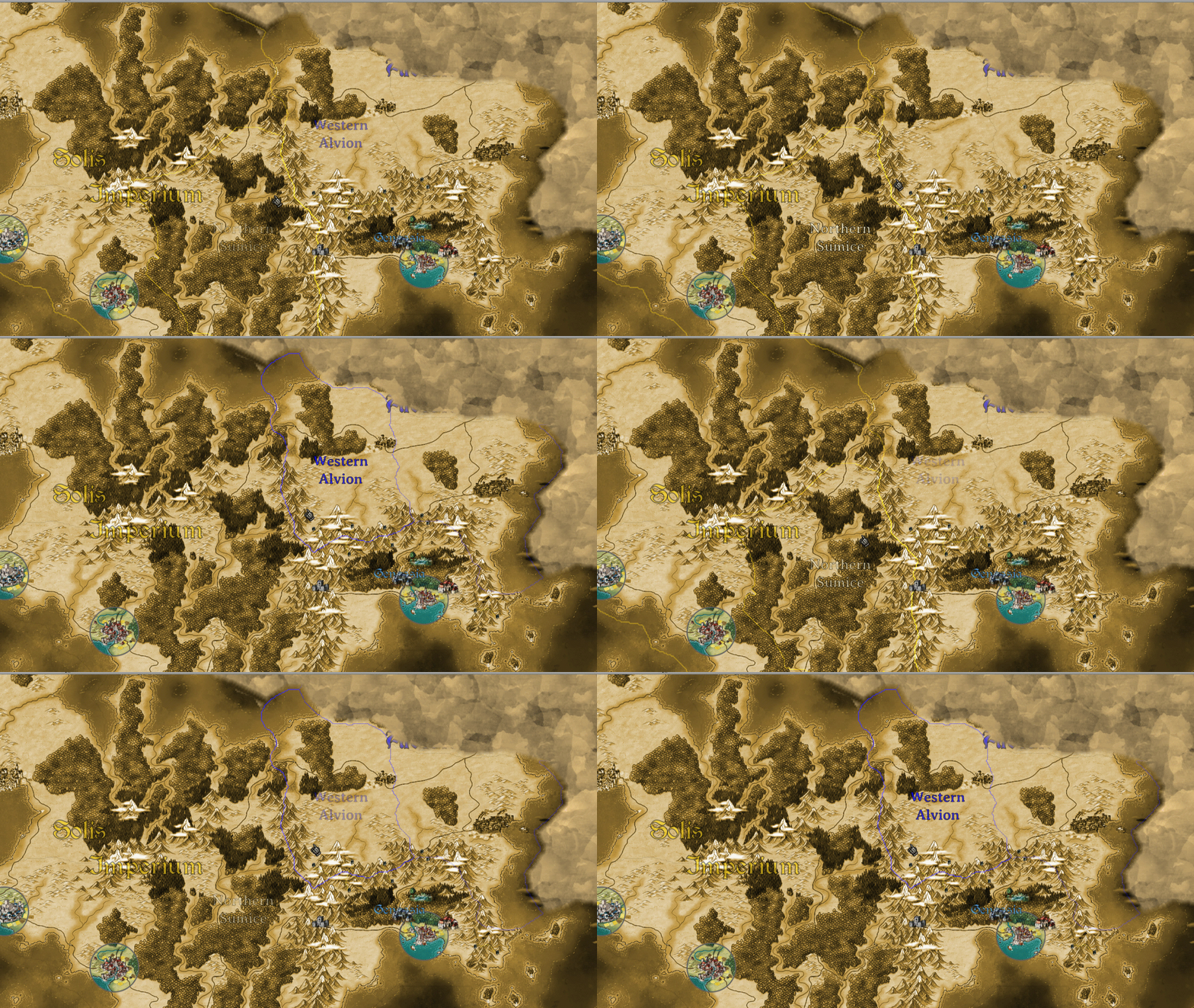
As you'll see here, I've changed to a sepia tone by default. The full color map was nice to look at, but I found that it was distracting. In theory, a more focused, intentional use of color will help to direct the user's eye to things I want them to interact with.
You'll note that the city of Genassia has a halo of color around it, and nearby quest locations are in color as well.
I've also reworked borders and map labels. Above, you'll see the cursor moving between two regions within two different countries. A faint border is drawn for the parent nation, and a stronger border is given to the region itself. You will also see a country label for larger nations like the Solis Imperium that becomes more visible as you pull back. Genassia is an independent nation consisting of only one region, so it's label follows the country rules (but it’s a bit hard to read in this image due to a location icon).
Here you'll see the new location detail dialog. This rolls open when you click on a location, and pins to the map instead of staying at the bottom of the screen. You'll see a simple skull indicator for threat level (one to five skulls), and a clear indication at the bottom of where expeditions can be sent from or redirected. Clicking on an access option will redirect a party or launch the expedition planner.
To the left will be the command console (seen here fully expanded). This view is definitely a work in progress, but you can see the general shape of things.
At the top, where the time control panel used to be, you can now see a view of the manor, along with your current gold and prestige values. Clicking on the manor image will take you to the manor view.
Beneath that, you'll see notifications, a list of active parties with their status information, the complete list of quest locations that you can visit, and all active cities that you can do business in. All of these are clickable to find or select the item in question.
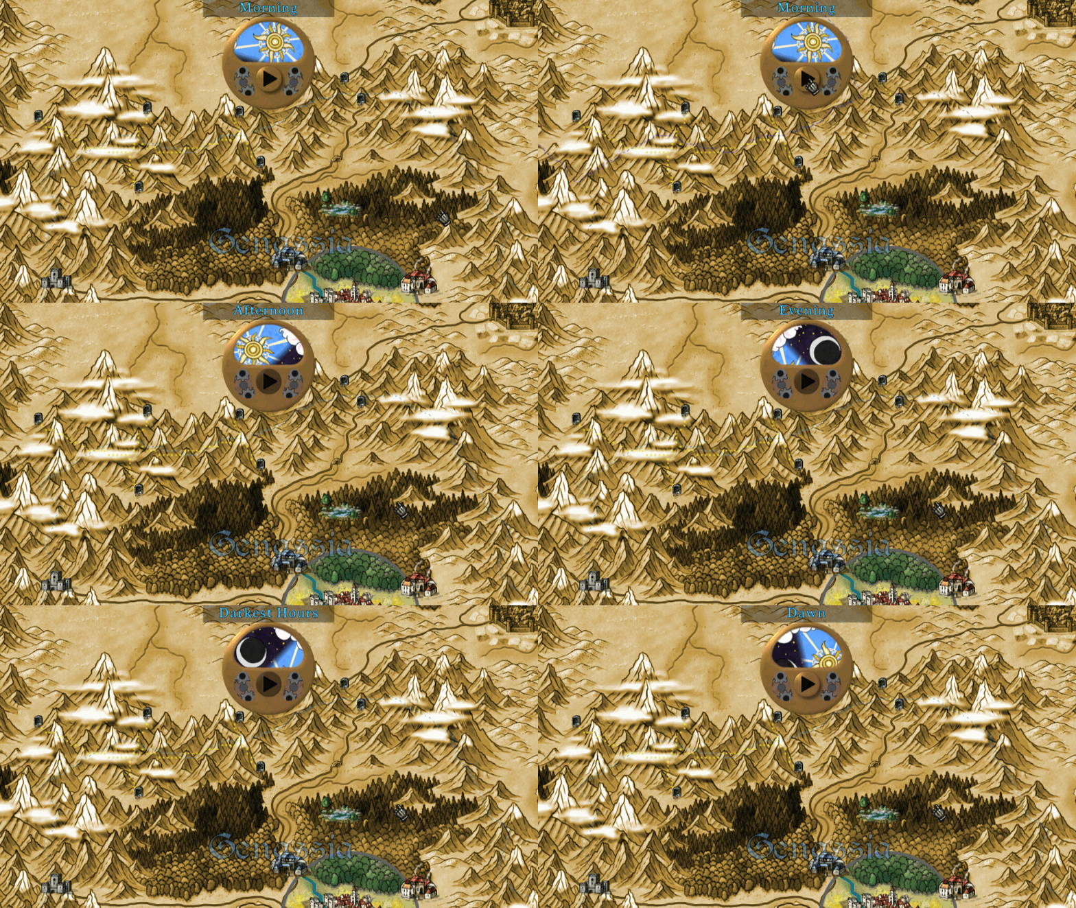
Here we see the new time widget!
It has been simplified in function to just have a play button (with a satisfying kerklunk-gearwhizz sound). Time will automatically pause for special events or at dawn, which will now be the only time you can send new orders.
Art for the sun and moon come from the new sun and moon arcana in the challenge card deck.
The exact date of the game calendar can be seen as a mouseover, if you need to dig in and find that information.
Finally, we have the new party widget with activity UI. I decided that the old party options dialog was mostly rubbish, so I've been moving those functions to the command console, the portraits list on the right, and to this contextually relevant menu on the map icon itself.
First of all, there's no more shield and sword icon, like you might have seen in older screenshots. Now the party is always represented by a figure of someone in the party, usually the captain, which can now also be animated to show that the party is actively walking somewhere or standing still.
The icon at the figure's feet is an activity indicator that shows what the party is doing at any given time. Clicking on that icon allows you to give new orders.
That's all for now. Thanks for stopping by, and have a great February!


